1 dataset 10 visualizations
As an educational project, can we create ten visualizations from one simple dataset?
The dataset is sourced from the 2022 Digital News Report by the Reuters Institute
on misinformation, showing the proportion who saw false or misleading information about each topic
in the last week, for selected regions.
Note: This is a independent, educational project and has no affiliation with the Reuters Institute whatsoever.
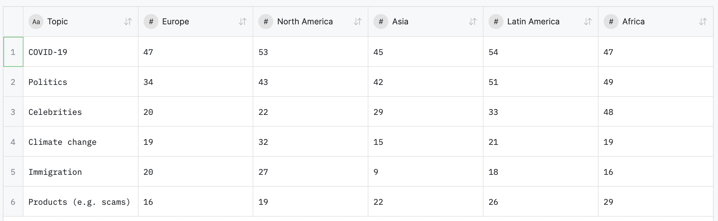
Q: Have you seen false or misleading information about any of the
following topics, in the last week? Base: Total sample in each region: Europe = 48,836, North
America = 4048, Asia = 20,349, Latin America = 12,104, Africa = 6057. Note: Africa average is Kenya,
South Africa, and Nigeria only (English speakers in South Africa and Nigeria).